
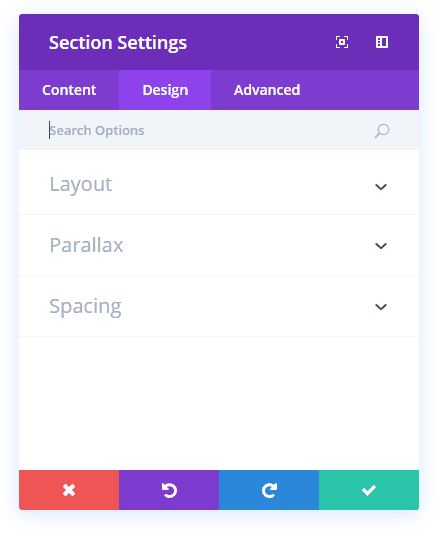
Divi Rows & Row Options
Divi Rows & Row Options
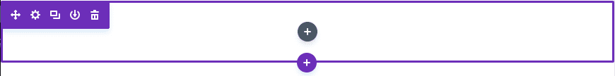
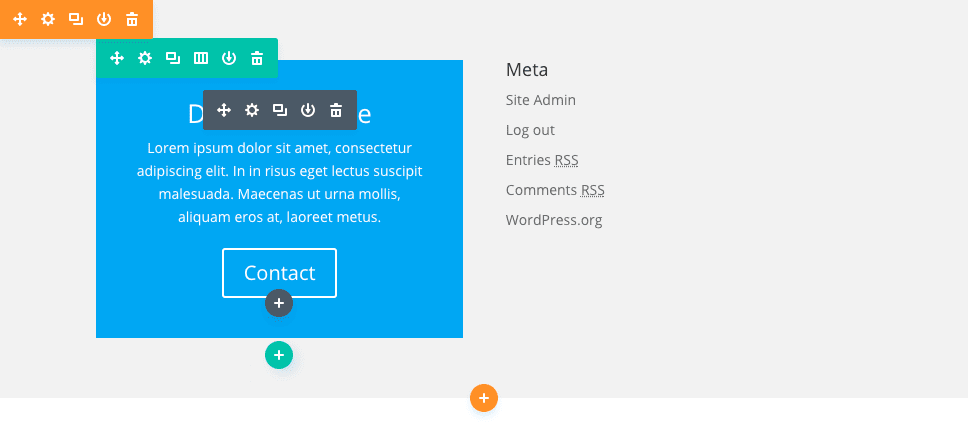
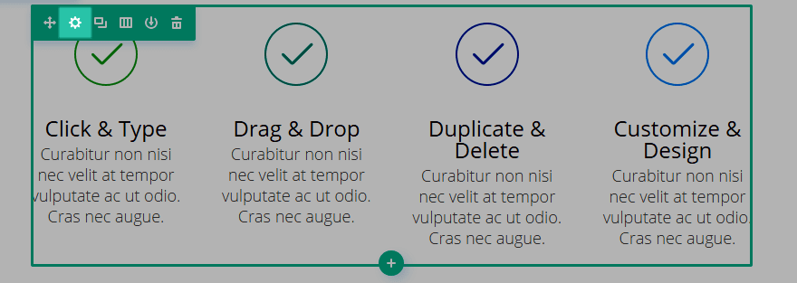
Rows are the various column layouts that can placed inside of sections. Much like modules, rows have various settings that can be accessed by clicking the settings icon on the top left of the row.
In this tutorial we will be going over just a few of the features and how they can be used to create some very unique layouts. Rows settings in particular can be used to greatly increase the variety of layouts built with the Divi Builder since they create the structure that your modules are housed in.
View full documentation:
Rows are the various column layouts that can placed inside of sections. Much like modules, rows have various settings that can be accessed by clicking the settings icon on the top left of the row. In this tutorial we will be going over just a few of the features and how they can be used to create some very unique layouts. Rows settings in particular can be used to greatly increase the variety of layouts built with the Divi Builder since they create the structure that your modules are housed in.
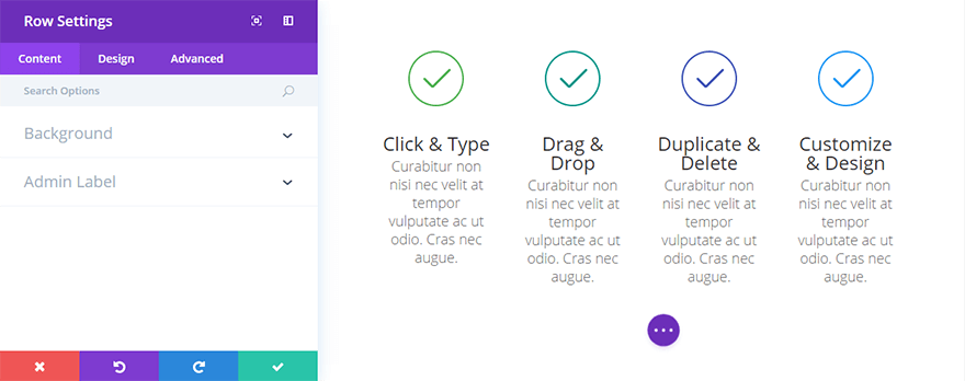
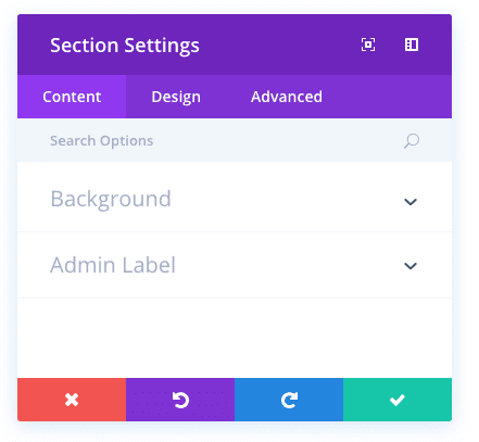
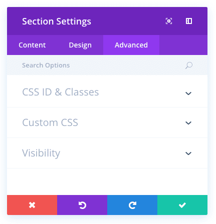
The Content Settings
Background Color
Background images can be applied to an entire row. By default, rows have a transparent background color.
Background Image
Background images can be applied to the an entire row.
Background Video MP4
Background videos can be applied to rows. If you would like to apply a background video, you must upload both an MP4 and WEBM video and input the videos here.
Background Video Webm
Background videos can be applied to rows. If you would like to apply a background video, you must upload both an MP4 and WEBM video and input the videos here.
Background Video Width
After your videos have been uploaded, you must input the width of your video here. It must be equal to the actual width of the video, otherwise the background position will be incorrect.
Background Video Height
After your videos have been uploaded, you must input the height of your video here. It must be equal to the actual height of the video, otherwise the background position will be incorrect.
Pause Video
If you would like videos to be paused when clicked, enable this option.
Column Background Color
For each column in a row, you can assign a unique background color.
Column Background Image
For each column in a row, you can assign a unique background image.
Admin Label
This will change the label of the module in the builder for easy identification. When using WireFrame view in the Visual Builder, these labels will appear within the module block in the Divi Builder interface.

The Design Settings
Use Parallax Effect
If you would like to use a parallax affect for your row background image, you can enabled here and then choose your desired parallax method.
Column Parallax Effect
Here you can choose whether or not to use parallax effect for the background image of a specific column in your row.
Make This Row Fullwidth
If this option is enabled, the row will extend the full width of the browser window (similar to a full width section). This is a great way to create cool fullwidth column layouts.
Use Custom Width
You can also assign a custom width to a row. For example if you would like to add some variation to the flow of the page and make a certain row larger than the rest, you can input a custom width value here
Use Custom Gutter Width
Gutter width adjusts the distance between columns. There are 4 gutter width sizes, ranging from none to large. Setting the gutter width to 1 will result in no space between columns. When combined with the Fullwidth Row option, this can create effects similar to the FullWidth Portfolio module.
Equalize Column Heights
This is a great option, especially useful when you have applied background colors to individual columns. Enabling this option will force all columns in the row to have the same height value.
Custom Padding
If you would like to adjust the padding of the row, you can do so here.
Custom Margin
If you would like to adjust the margin of the row, you can do so here.
Column Custom Padding
If you would like to adjust the padding of a specific column in your row, you can do so here.
Column Custom Margin
If you would like to adjust the margin of a specific column in your row, you can do so here.
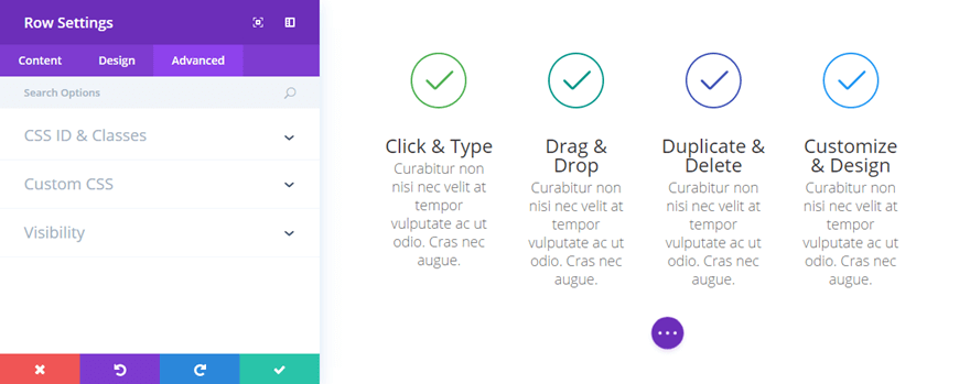
The Advanced Settings
CSS ID
You can assign an CSS ID to the row if you would like to target it in your stylesheet or with anchor links.
CSS CLASS
You can assign an CSS Class to the row if you would like to target it in your stylesheet.
Column CSS ID
You can assign an CSS ID to a specific column in your row if you would like to target it in your stylesheet or with anchor links.
Column CSS CLASS
You can assign an CSS Class to a specific column in your row if you would like to target it in your stylesheet.
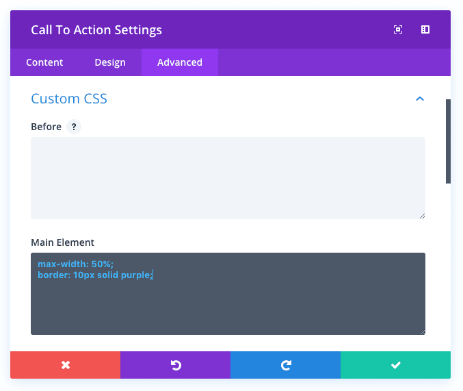
Before
Input CSS here to be applied :before the main row div.
Main Element
Input CSS here to be applied to the main row div.
After
Input CSS here to be applied :after the main row div.
Column Before
Input CSS here to be applied :before the specified column div.
Column Main Element
Input CSS here to be applied to the specified column div.
Column After
Input CSS here to be applied :after the specified column div.
Visibility
This option lets you control which devices your row module appears on. You can choose to disable your module on tablets, smart phones or desktop computers individually. This is useful if you want to use different modules on different devices, or if you want to simplify the mobile design by eliminating certain elements from the page.
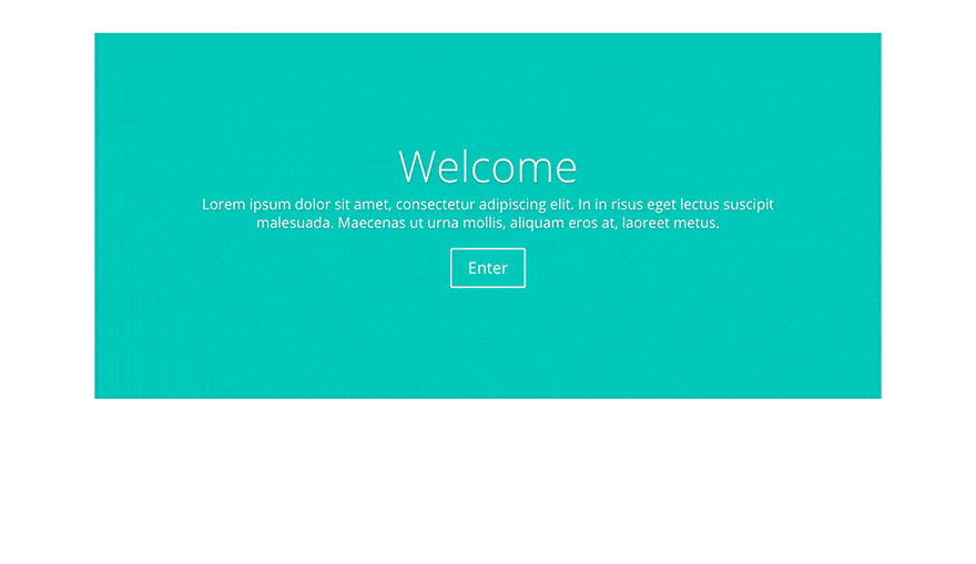
Let’s Give Some Settings A Test Drive
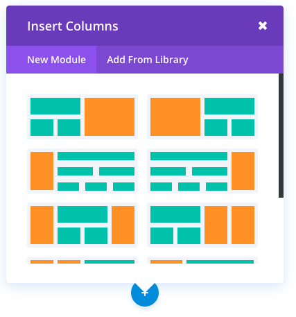
Now that we have gone over all of the settings, let’s test out a few in combination to show you what’s possible when each setting is used creatively. In this example I will be touching on the Fullwidth Row setting as an introduction. The option to make a row “Fullwidth” is one of the most versatile options in the set. This will extend the width of the row to the edge of the browser, similar to a Fullwidth Section. Unlike a Fullwidth Section, however, FullWidth Rows can have column structures and they can house any module! In the example below I have created a 4 column row and added a square image to each column. Next I enabled the “Make Row Fullwidth” to extend the row to the edges of the browser window.
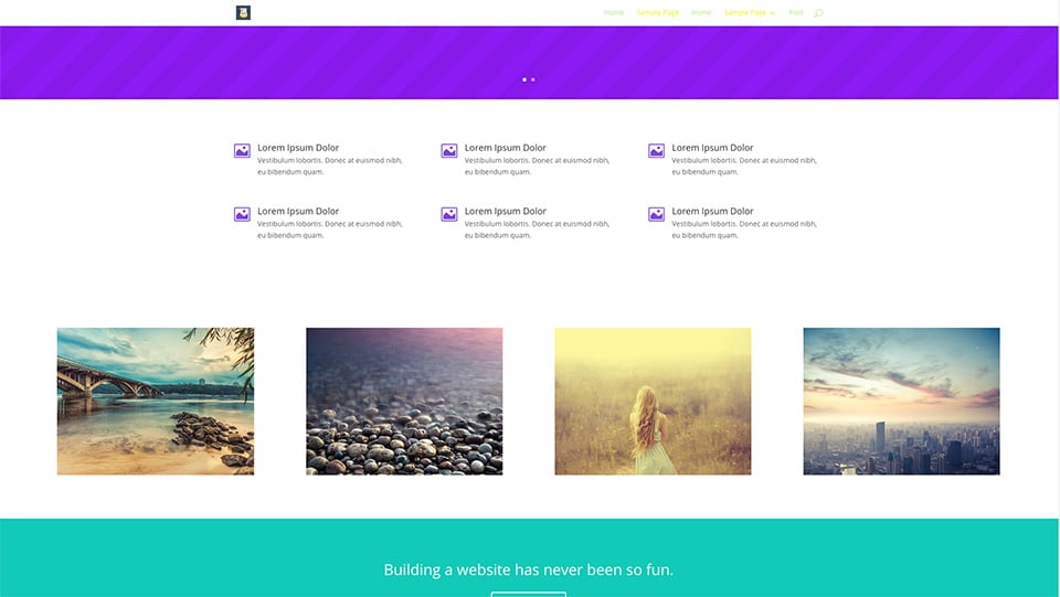
Next I reduced the “Gutter Width” size to “1” to remove the spacing between columns in the row.
Finally I removed the padding above and below the row by changing “Custom Padding” top and bottom values to “0.”
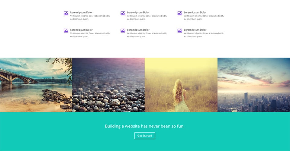
The result is a complete transformation of the row, turning our normal 4 column row of images into a full-width and full-bleed image gallery that looks stunning against the green section below it. This same effect can be created using custom column background colors and text-based modules as well. The possibilities are endless!