An Overview Of Divi Sections
Sections are the builder’s largest building blocks, and can be used in various ways.
View full documentation:
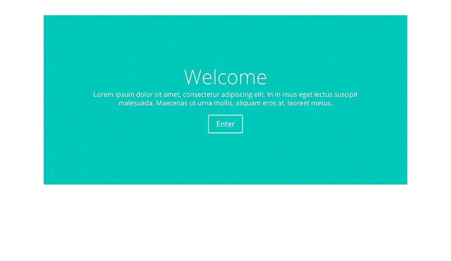
Sections are the biggest building block in the Divi builder. You can think of them as horizontal stacking blocks that can group your content into visually distinguishable areas. In Divi, everything you build starts with a section. This content wrapper has various settings that can be used to do some really awesome things.
How To Add A Section To Your Page
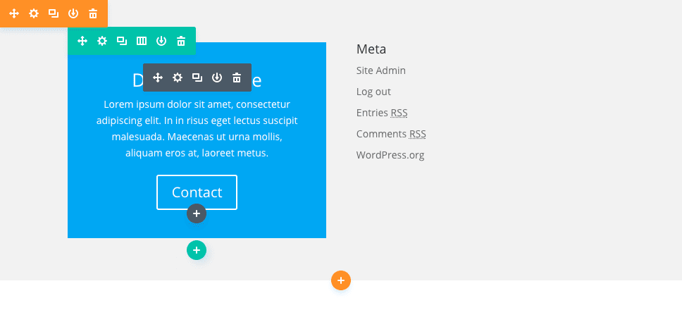
Before you can add a section module to your page, you will first need to jump into the Divi Builder. Once the Divi Theme has been installed on your website, you will notice a Use Divi Builder button above the post editor every time you are building a new page. Clicking this button will enable the Divi Builder, giving you access to all of the Divi Builder’s modules. Next, click the Use Visual Builder button to launch the builder in Visual Mode. You can also click the Use Visual Builder button when browsing your website on the front end if you are logged in to your WordPress Dashboard.

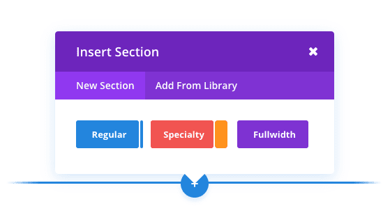
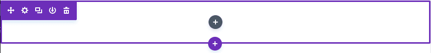
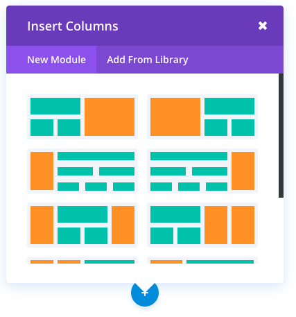
Once you have entered the Visual Builder, you can click the blue plus button to add a new section to your page. You will be greeted with a popup that allows you to add any of Divi’s three section types. These types include: Standard, Specialty and Fullwidth.
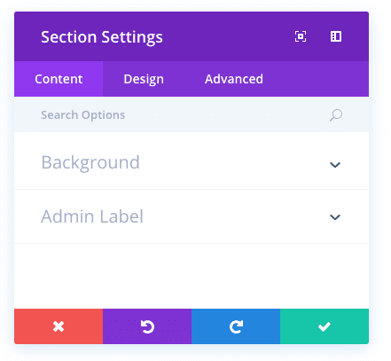
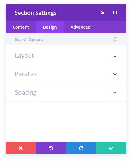
Once the section has been added, you will be greeted with the section’s list of options. These options are separated into three main groups: Content, Design and Advanced.
Section Content Options
Within the content tab you will find all of the section’s content elements. For sections, these content elements are limited to background elements such as background images and videos.
Background Image
If defined, this image will be used as the background for this module. To remove a background image, simply delete the URL from the settings field.
Background Color
If defined, this image will be used as the background for this module. To remove a background image, simply delete the URL from the settings field.
Background Video MP4
All videos should be uploaded in both .MP4 .WEBM formats to ensure maximum compatibility in all browsers. Upload the .MP4 version here. Video backgrounds are disabled from mobile devices. Instead, your background image will be used. For this reason, you should define both a background image and a background video to ensure best results. Important Note: In order for the MP4 video format to work in all browsers, your server must have the correct MIME types designated. You can learn more about using .htaccess to define MIME types here. If you notice your videos are not playing in certain browsers, then this is likely the reason.
Background Video WEBM
All videos should be uploaded in both .MP4 .WEBM formats to ensure maximum compatibility in all browsers. Upload the .WEBM version here. Video backgrounds are disabled from mobile devices. Instead, your background image will be used. For this reason, you should define both a background image and a background video to ensure best results. Important Note: In order for the WEBM video format to work in all browsers, your server must have the correct MIME types designated. You can learn more about using .htaccess to define MIME types here. If you notice your videos are not playing in certain browsers, then this is likely the reason.
Background Video Width
In order for videos to be sized correctly, you must input the exact width (in pixels) of your video here.
Background Video Height
In order for videos to be sized correctly, you must input the exact height (in pixels) of your video here.
Admin Label
In this dropdown you can add an admin label that will appear in the back end builder as well as the visual builder’s skeleton view.
Section Design Options
Within the design tab you will find all of the section’s styling options, such as sizing and spacing. This is the tab you will use to change how your section looks. Every Divi section type has a long list of design settings that you can use to change just about anything.
Show Inner Shadow
Here you can select whether or not your section has an inner shadow. This can look great when you have colored backgrounds or background images.
Use Parallax Effect
If enabled, your background image will stay fixed as your scroll, creating a fun parallax-like effect. You can also choose between two parallax methods: CSS and True Parallax.
Custom Padding
Here you can adjust the padding of the section to specific values, or leave blank to use the default padding.
Section Advanced Options
Within the advanced tab, you will find options that more experienced web designers might find useful, such as custom CSS and HTML attributes. Here you can apply custom CSS to your section. You can also apply custom CSS classes and IDs to the section, which can be used to customize the section within your child theme’s style.css file.
CSS ID
Enter an optional CSS ID to be used for this section. An ID can be used to create custom CSS styling, or to create links to particular sections of your page.
CSS Class
Enter optional CSS classes to be used for this section. A CSS class can be used to create custom CSS styling. You can add multiple classes, separated with a space. These classes can be used in your Divi Child Theme or within the Custom CSS that you add to your page or your website using the Divi Theme Options or Divi Builder Page Settings.
Custom CSS
Custom CSS can be applied to the section here. Within the Custom CSS section, you will find a text field where you can add custom CSS directly to each element. CSS input into these settings are already wrapped within style tags, so you need only enter CSS rules separated by semicolons.
Visibility
This option lets you control which devices your section appears on. You can choose to disable your section on tablets, smart phones or desktop computers individually. This is useful if you want to use different sections on different devices, or if you want to simplify the mobile design by eliminating certain sections from the page.
Using Fullwidth Sections
Fullwidth sections give you access to a new set of Fullwidth Modules. These modules act a little differently because they take advantage of the full width of the browser. Fullwidth modules can only be placed within Fullwidth sections.
Once you add a new fullwidth section to your page, you can click the “Add Modules” button within the section to add a fullwidth module. Unlike normal section, there is no concept of rows or columns, since the fullwidth modules always takes advantage of 100% of the screen. Fullwidth modules are a great way to add a visual break to the page!
A great example of a fullwidth module is the fullwidth slider. This fullwidth slider works just like a normal slider, except that it expands to 100% width. Displaying a slider at such a scale can be quite stunning, just check our the divi demo for an example.
Using Specialty Sections
Specialty sections were created to allow for more advanced column structures. Unlike normal sections, when you use a specialty section, you can add complex column variations next to full-spanning vertical sidebars, without adding unwanted breaks to the page. These types of layouts are not possible using normal sections.
Once you add a specialty section to the page, you will notice that one area has an “add module” button, while the other has an “insert row” button. The “insert module” area represents your vertical sidebar. You can add as many modules here, in a single row, and they will span the vertical width of the section, adjacent to the column structure you build next to it. Clicking “insert row” will allow you to insert additional rows to the left/right of your sidebar. In a way, this can be thought of as adding rows within rows!
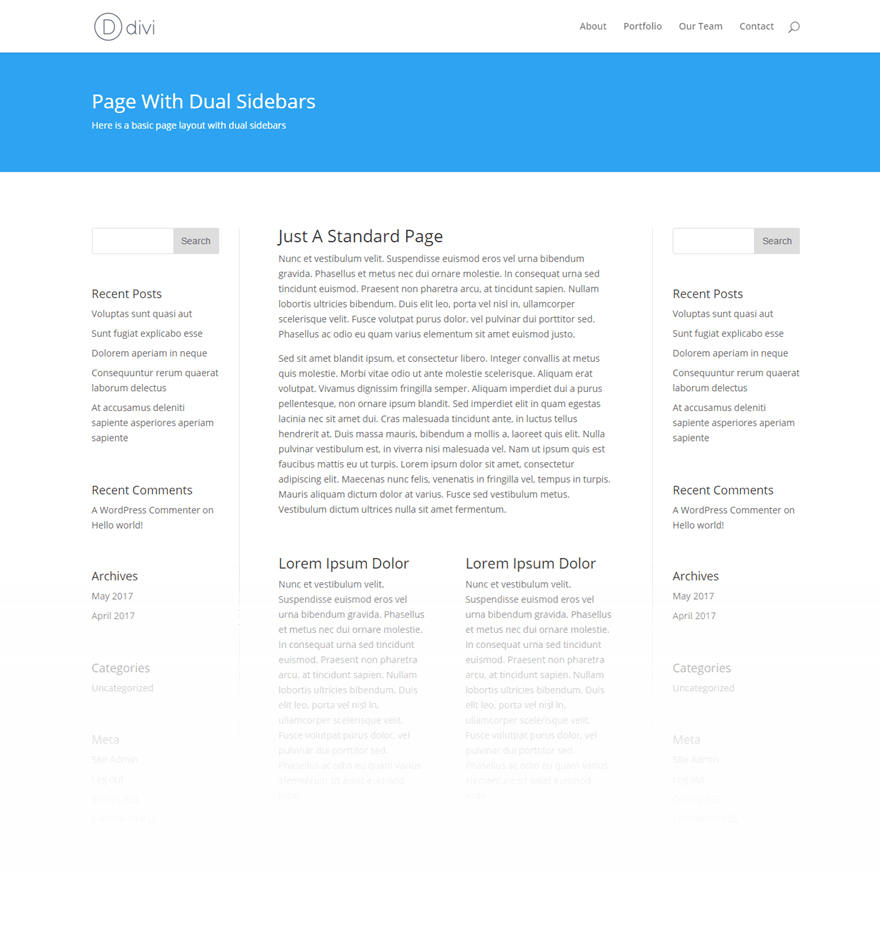
The result is the ability to create just about any column structure that you could dream of, and no matter what structure you choose, we have made sure that the combination will look great! Here is an example of a page layout created using specialty sections. As you can see, the effect is a dual-sidebar layout, with two vertical-spanning rows on the left/right of a complex column structure in the middle.