The Divi Person Module
How to add, configure and customize the Divi person module.
View full documentation:
The Person Modules is the best way to create a personal profile block. This is a great module to use on About Me or Team Member pages where you want to create a bio of individual people. This module combined text, imagery and social media links into a single, cohesive module.
VIEW A LIVE DEMO OF THIS MODULE
How To Add A Person Module To Your Page
Before you can add a person module to your page, you will first need to jump into the Divi Builder. Once the Divi Theme has been installed on your website, you will notice a Use Divi Builder button above the post editor every time you are building a new page. Clicking this button will enable the Divi Builder, giving you access to all of the Divi Builder’s modules. Next, click the Use Visual Builder button to launch the builder in Visual Mode. You can also click the Use Visual Builder button when browsing your website on the front end if you are logged in to your WordPress Dashboard.

Once you have entered the Visual Builder, you can click the gray plus button to add a new module to your page. New modules can only be added inside of Rows. If you are starting a new page, don’t forget to add a row to your page first. We have some great tutorials about how to use Divi’s row and section elements.
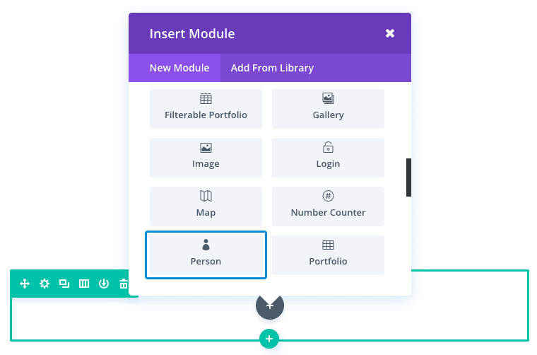
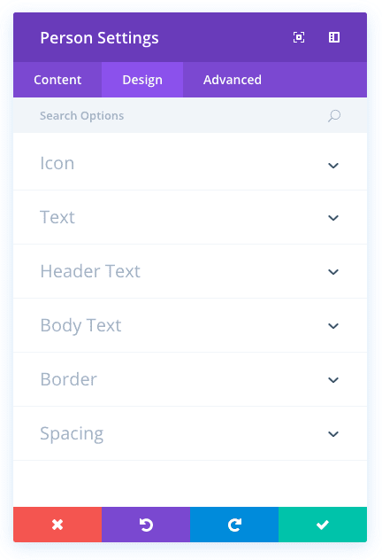
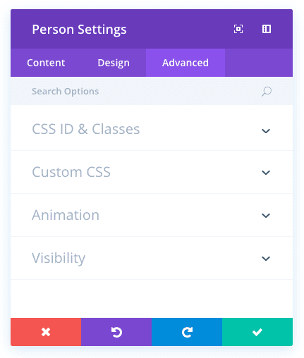
Locate the person module within the list of modules and click it to add it to your page. The module list is searchable, which means you can also type the word “person” and then click enter to automatically find and add the person module! Once the module has been added, you will be greeted with the module’s list of options. These options are separated into three main groups: Content, Design and Advanced.
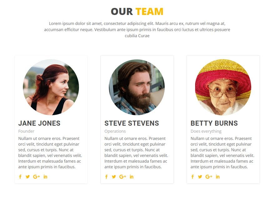
Use Case Example: Adding an “Our Team” Section to an About Page
The about page is good place to feature your team members using the Person Module. This adds a personal touch and can help build trust with new clients.
For this example I’m going to show you how to use the Person Module to add an “Our Team” section to an about page for a small business. I’m going to use a three person, three column layout which keeps the section more compact and fits the overall design of the page.

Using the Visual Builder, insert a new standard section with a three column (1/3 1/3 1/3) row. Then add a Person Module to the first column.

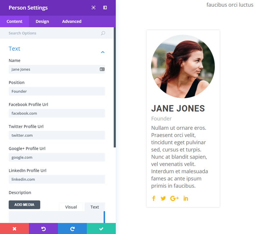
Update the Person Module Settings as follows:
Content Options
Name: [Enter Person’s Name]
Position: [Enter Person’s Job Position]
Enter Social Media Profile URLs
Description: [Enter a short bio]
Image: [Enter a 600 x 600 image] I’m using a custom circle image for this example
Design Options
Icon Color: #fcbf00
Icon Hover Color: #e0a831
Header Font: Roboto, bold, capitalize
Header Font Size: 30px
Header Text Color: #505050
Header Letter Spacing: 1px
Header Line Height: 1.5em
Body Font Size: 18px
Body Line Height: 1.4em
Custom Padding: 15px Top, 15px Right, 15px Bottom, 15px Left
Advanced Options (Custom CSS)
Main Element:
-webkit-box-shadow: 0 1px 5px rgba(0, 0, 0, 0.2);
-moz-box-shadow: 0 1px 5px rgba(0, 0, 0, 0.2);
box-shadow: 0 1px 5px rgba(0, 0, 0, 0.2);
Save Settings
Now duplicate the Person Module you just created two times and drag the duplicated modules to the second and third columns of the row. Since the design has carried over for each of the duplicated Person Modules, all you have to do is update the content with the person’s image, title, position, social media URLs, and description.
That’s it!
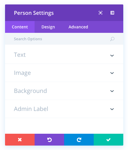
Person Content Options
Within the content tab you will find all of the module’s content elements, such as text, images and icons. Anything that controls what appears in your module will always be found within this tab.
Name
This is the name of the person you are featuring. The name is displayed at the top of the module in larger text.
Position
Position is displayed below the name in smaller text. This is often used to denote the professional position of a person within a corporate team. For example, Nick Roach, “Graphic Designer.”
Facebook Profile URL
Input the URl to your Facebook page, or leave it blank to disable the Facebook icon.
Twitter Profile URL
Input the URl to your Twitter page, or leave it blank to disable the Twitter icon.
Google+ Profile URL
Input the URl to your Google+ page, or leave it blank to disable the Google+ icon.
LinkedIn Profile URL
Input the URl to your LinkedIn page, or leave it blank to disable the LinkedIn icon.
Description
Input the main text content for your module here.
Image URL
Here you can upload a photograph to be used in the bio.
Background Color
Define a custom background color for your module, or leave blank to use the default color.
Background Image
If defined, this image will be used as the background for this module. To remove a background image, simply delete the URL from the settings field. Background images will appear above background colors, which means your background color will not be visible when a background image is applied.
Admin Label
This will change the label of the module in the builder for easy identification. When using WireFrame view in the Visual Builder, these labels will appear within the module block in the Divi Builder interface.
Person Design Options
Within the design tab you will find all of the module’s styling options, such as fonts, colors, sizing and spacing. This is the tab you will use to change how your module looks. Every Divi module has a long list of design settings that you can use to change just about anything.
Icon Color
This option controls the color of the social media icons that appear within each person’s profile. By default these icons are gray, buy you can change that color using this setting.
Icon Hover Color
You can also change the hover color of the social media icons. Select your desired color using the color picker in this setting.
Text Color
Here you can choose the value of your text. If you are working with a dark background, then your text should be set to light. If you are working with a light background, then your text should be dark.
Header Font
You can change the font of your header text by selecting your desired font from the dropdown menu. Divi comes with dozens of great fonts powered by Google Fonts. By default, Divi uses the Open Sans font for all text on your page. You can also customize the style of your text using the bold, italic, all-caps and underline options.
Header Font Size
Here you can adjust the size of your header text. You can drag the range slider to increase or decrease the size of your text, or you can input your desired text size value directly into the input field to the right of the slider. The input fields supports different units of measurement, which means you can input “px” or “em” following your size value to change its unit type.
Header Text Color
By default, all text colors in Divi will appear as white or dark gray. If you would like to change the color of your header text, choose your desired color from the color picker using this option.
Header Letter Spacing
Letter spacing affects the space between each letter. If you would like to increase the space between each letter in your header text, use the range slider to adjust the space or input your desired spacing size into the input field to the right of the slider. The input fields supports different units of measurement, which means you can input “px” or “em” following your size value to change its unit type.
Header Line Height
Line height affects the space between each line of your header text If you would like to increase the space between each line, use the range slider to adjust the space or input your desired spacing size into the input field to the right of the slider. The input fields supports different units of measurement, which means you can input “px” or “em” following your size value to change its unit type.
Body Font
You can change the font of your body text by selecting your desired font from the dropdown menu. Divi comes with dozens of great fonts powered by Google Fonts. By default, Divi uses the Open Sans font for all text on your page. You can also customize the style of your text using the bold, italic, all-caps and underline options.
Body Font Size
Here you can adjust the size of your body text. You can drag the range slider to increase or decrease the size of your text, or you can input your desired text size value directly into the input field to the right of the slider. The input fields supports different units of measurement, which means you can input “px” or “em” following your size value to change its unit type.
Body Text Color
By default, all text colors in Divi will appear as white or dark gray. If you would like to change the color of your body text, choose your desired color from the color picker using this option.
Body Letter Spacing
Letter spacing affects the space between each letter. If you would like to increase the space between each letter in your body text, use the range slider to adjust the space or input your desired spacing size into the input field to the right of the slider. The input fields supports different units of measurement, which means you can input “px” or “em” following your size value to change its unit type.
Body Line Height
Line height affects the space between each line of your body text If you would like to increase the space between each line, use the range slider to adjust the space or input your desired spacing size into the input field to the right of the slider. The input fields supports different units of measurement, which means you can input “px” or “em” following your size value to change its unit type.
Use Border
Enabling this option will place a border around your module. This border can be customized using the following conditional settings.
Border Color
This option affects the color of your border. Select a custom color from the color picker to apply it to your border.
Border Width
By default, borders have a width of 1 pixel. You can increase this value by dragging the range slider or by inputting a custom value into the input field to the right of the slider. Custom units of measurements of supported, which means you can change the default unit from “px” to something else, such as em, vh, vw etc.
Border Style
Borders support eight different styles, including: solid, dotted, dashed, double, groove, ridge, inset and outset. Select your desired style from the dropdown menu to apply it to your border.
Custom Margin
Margin is the space added outside of your module, between the module and the next element above, below or to the left and right of it. You can add custom margin values to any of the module’s four sides. To remove custom margin, delete the added value from the input field. By default these values are measured in pixels, but you can input custom units of measurement into the input fields.
Custom Padding
Padding is the space added inside of your module, between the edge of the module and its internal elements. You can add custom padding values to any of the module’s four sides. To remove custom margin, delete the added value from the input field. By default these values are measured in pixels, but you can input custom units of measurement into the input fields.
Person Advanced Options
Within the advanced tab, you will find options that more experienced web designers might find useful, such as custom CSS and HTML attributes. Here you can apply custom CSS to any of the module’s many elements. You can also apply custom CSS classes and IDs to the module, which can be used to customize the module within your child theme’s style.css file.
CSS ID
Enter an optional CSS ID to be used for this module. An ID can be used to create custom CSS styling, or to create links to particular sections of your page.
CSS Class
Enter optional CSS classes to be used for this module. A CSS class can be used to create custom CSS styling. You can add multiple classes, separated with a space. These classes can be used in your Divi Child Theme or within the Custom CSS that you add to your page or your website using the Divi Theme Options or Divi Builder Page Settings.
Custom CSS
Custom CSS can also be applied to the module and any of the module’s internal elements. Within the Custom CSS section, you will find a text field where you can add custom CSS directly to each element. CSS input into these settings are already wrapped within style tags, so you need only enter CSS rules separated by semicolons.
Animation
By default, images are animated in as you scroll down the page. Here you can choose the direction of the animation, or disabled it desired.
Visibility
This option lets you control which devices your module appears on. You can choose to disable your module on tablets, smart phones or desktop computers individually. This is useful if you want to use different modules on different devices, or if you want to simplify the mobile design by eliminating certain elements from the page.