The Divi Fullwidth Header Module
How to add, configure and customize the Divi fullwidth header module.
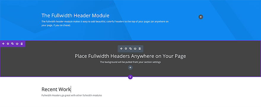
The fullwidth header module makes it easy to add beautiful, colorful headers to the top of your pages (or anywhere on your page, if you so chose). These modules can only be placed within full width sections.
View full documentation:
The fullwidth header module makes it easy to add beautiful, colorful headers to the top of your pages (or anywhere on your page, if you so chose). These modules can only be placed within full width sections.
VIEW A LIVE DEMO OF THIS MODULE
How To Add A Fullwidth Header Module To Your Page
Before you can add a fullwidth header module to your page, you will first need to jump into the Divi Builder. Once the Divi Theme has been installed on your website, you will notice a Use Divi Builder button above the post editor every time you are building a new page. Clicking this button will enable the Divi Builder, giving you access to all of the Divi Builder’s modules. Next, click the Use Visual Builder button to launch the builder in Visual Mode. You can also click the Enable Visual Builder button when browsing your website on the front end if you are logged in to your WordPress Dashboard.

Once you have entered the Visual Builder, you can click the gray plus button to add a new module to your page. New fullwidth modules can only be added inside of fullwidth sections. If you are starting a new page, don’t forget to add a fullwidth section to your page first. We have some great tutorials about how to use Divi’s section elements.
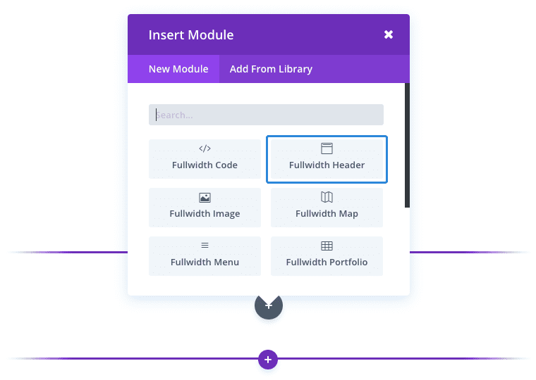
Locate the fullwidth header module within the list of modules and click it to add it to your page. The module list is searchable, which means you can also type the word “fullwidth header” and then click enter to automatically find and add the fullwidth header module! Once the module has been added, you will be greeted with the module’s list of options. These options are separated into three main groups: Content, Designand Advanced.
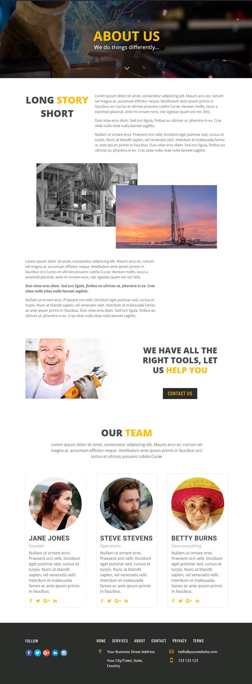
Use Case Example: Adding a Fullwidth Header to an About Page
For this example I’m going to show you how to use the Fullwidth Header Module to add a header with customized text and a background image.
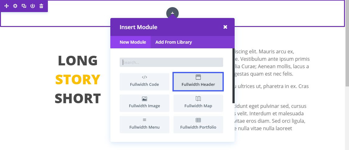
All Fullwidth Modules are only available when using Fullwidth sections. Using the Visual Builder, insert a new Fullwidth Section. Then add a Person Module to the section.
Update the Fullwidth Header Settings as follows:
Content Options
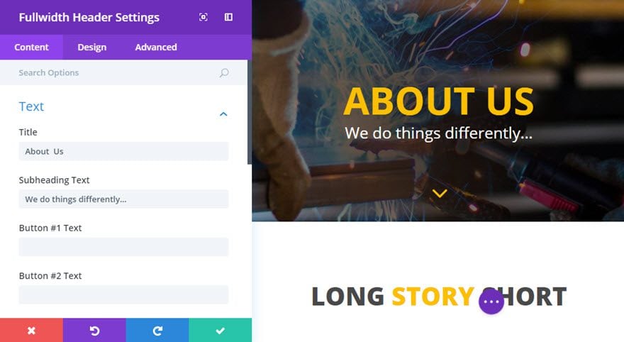
Title: About Us
Subheading Text: We do things differently…
Background Image URL: [insert a 1920 x 800 image]
Background Overlay Color: rgba(0,0,0,0.2)
Design Options
Text & Logo Orientation: Center
Show Scroll Down Button: YES
Icon: [select icon]
Scroll Down Icon Color: #fcbf00
Scroll Down Icon Size: 50px
Text Color: Light
Title Text Color: #fcbf00
Title Font: Open Sans, Bold, Uppercase
Title Font Size: 60px (desktop), 40px (tablet), 30px (phone)
Subhead Font Size: 25px
Advanced Options (Custom CSS)
Main Element:
padding: 100px 0;
That’s it!

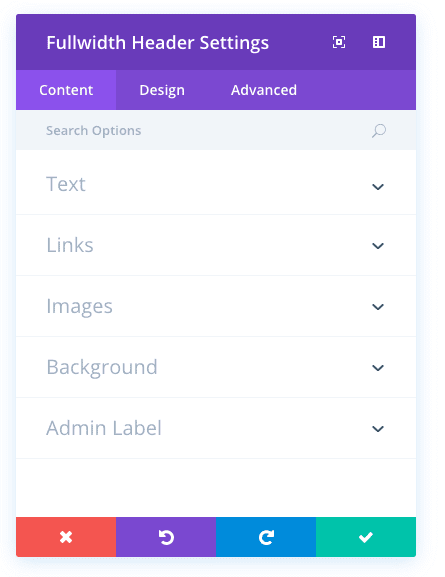
Fullwidth Header Content Options
Within the content tab you will find all of the module’s content elements, such as text, images and icons. Anything that controls what appears in your module will always be found within this tab.
Title
Enter your page title here.
Subheading Text
If you would like to use a subhead, add it here. Your subhead will appear below your title in a small font.
Button #1 Text
Enter the text for the Button.
Button #2 Text
Enter the text for the Button.
Content
Here you can define the content that will be placed below the header and title text.
Button #1 URL
Enter the URL for the Button.
Button #2 URL
Enter the URL for the Button.
Logo Image URL
Upload your desired image, or type in the URL to the image you would like to display.
Header Image URL
Upload your desired image, or type in the URL to the image you would like to display.
Background Image URL
If defined, this image will be used as the background for this module. To remove a background image, simply delete the URL from the settings field. Background images will appear above background colors, which means your background color will not be visible when a background image is applied.
Background Color
Define a custom background color for your module, or leave blank to use the default color.
Background Overlay Color
Choose a background overlay color, which will be placed on top of the background image. Semi-transparent backhround overlay images can create cool effects when placed above background images.
Admin Label
This will change the label of the module in the builder for easy identification. When using WireFrame view in the Visual Builder, these labels will appear within the module block in the Divi Builder interface.
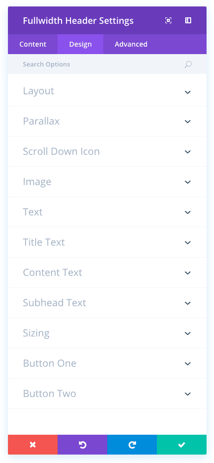
Fullwidth Header Design Options
Within the design tab you will find all of the module’s styling options, such as fonts, colors, sizing and spacing. This is the tab you will use to change how your module looks. Every Divi module has a long list of design settings that you can use to change just about anything.
Text & Logo Orientation
This controls the how your text is aligned within the module.
Make Fullscreen
Here you can choose whether the header is expanded to fullscreen size.
Use Parallax effect
If enabled, your background images will have a fixed position as your scroll, creating a fun parallax-like effect.
Parallax method
Define the method, used for the parallax effect.
Show Scroll Down Button
Here you can choose whether the scroll down button is shown.
Icon
Choose an icon to display for the scroll down button.
Scroll Down Icon Color
By default, the scroll down icon inherits the color of your header text (white or gray). You can change this color by adjusting the color in this option using the color picker.
Scroll Down Icon Size
Use this setting to increase or decrease the size of the scroll down icon that appears at the bottom of your header.
Image Vertical Alignment
This controls the orientation of the image within the module.
Text Color
Here you can choose the value of your text. If you are working with a dark background, then your text should be set to light. If you are working with a light background, then your text should be dark.
Text Vertical Alignment
This setting determines the vertical alignment of your content. Your content can either be vertically centered, or aligned to the bottom.
Title Font
You can change the font of your title text by selecting your desired font from the dropdown menu. Divi comes with dozens of great fonts powered by Google Fonts. By default, Divi uses the Open Sans font for all text on your page. You can also customize the style of your text using the bold, italic, all-caps and underline options.
Title Font Size
Here you can adjust the size of your title text. You can drag the range slider to increase or decrease the size of your text, or you can input your desired text size value directly into the input field to the right of the slider. The input fields supports different units of measurement, which means you can input “px” or “em” following your size value to change its unit type.
Title Text Color
By default, all text colors in Divi will appear as white or dark gray. If you would like to change the color of your title text, choose your desired color from the color picker using this option.
Title Letter Spacing
Letter spacing affects the space between each letter. If you would like to increase the space between each letter in your title text, use the range slider to adjust the space or input your desired spacing size into the input field to the right of the slider. The input fields supports different units of measurement, which means you can input “px” or “em” following your size value to change its unit type.
Title Line Height
Line height affects the space between each line of your title text If you would like to increase the space between each line, use the range slider to adjust the space or input your desired spacing size into the input field to the right of the slider. The input fields supports different units of measurement, which means you can input “px” or “em” following your size value to change its unit type.
Content Font
You can change the font of your content text by selecting your desired font from the dropdown menu. Divi comes with dozens of great fonts powered by Google Fonts. By default, Divi uses the Open Sans font for all text on your page. You can also customize the style of your text using the bold, italic, all-caps and underline options.
Content Font Size
Here you can adjust the size of your content text. You can drag the range slider to increase or decrease the size of your text, or you can input your desired text size value directly into the input field to the right of the slider. The input fields supports different units of measurement, which means you can input “px” or “em” following your size value to change its unit type.
Content Text Color
By default, all text colors in Divi will appear as white or dark gray. If you would like to change the color of your content text, choose your desired color from the color picker using this option.
Content Letter Spacing
Letter spacing affects the space between each letter. If you would like to increase the space between each letter in your content text, use the range slider to adjust the space or input your desired spacing size into the input field to the right of the slider. The input fields supports different units of measurement, which means you can input “px” or “em” following your size value to change its unit type.
Content Line Height
Line height affects the space between each line of your content text If you would like to increase the space between each line, use the range slider to adjust the space or input your desired spacing size into the input field to the right of the slider. The input fields supports different units of measurement, which means you can input “px” or “em” following your size value to change its unit type.
Subhead Font
You can change the font of your subhead text by selecting your desired font from the dropdown menu. Divi comes with dozens of great fonts powered by Google Fonts. By default, Divi uses the Open Sans font for all text on your page. You can also customize the style of your text using the bold, italic, all-caps and underline options.
Subhead Font Size
Here you can adjust the size of your subhead text. You can drag the range slider to increase or decrease the size of your text, or you can input your desired text size value directly into the input field to the right of the slider. The input fields supports different units of measurement, which means you can input “px” or “em” following your size value to change its unit type.
Subhead Text Color
By default, all text colors in Divi will appear as white or dark gray. If you would like to change the color of your subhead text, choose your desired color from the color picker using this option.
Subhead Letter Spacing
Letter spacing affects the space between each letter. If you would like to increase the space between each letter in your subhead text, use the range slider to adjust the space or input your desired spacing size into the input field to the right of the slider. The input fields supports different units of measurement, which means you can input “px” or “em” following your size value to change its unit type.
Subhead Line Height
Line height affects the space between each line of your subhead text If you would like to increase the space between each line, use the range slider to adjust the space or input your desired spacing size into the input field to the right of the slider. The input fields supports different units of measurement, which means you can input “px” or “em” following your size value to change its unit type.
Text Max Width
Use this setting to reduce the max width of the text within the header module. For example, a value 50% will ensure that the text is never more than 50% of the width of the overall header module.
Use Custom Styles for Button
Enabling this option will reveal various button customization settings that you can use to change the appearance of your module’s button.
Button Text Size
This setting can be used to increase or decrease the size of the text within the button. The button will scale as the text size is increased and decreased.
Button Text Color
By default, buttons assume your theme accent color as defined in the Theme Customizer. This option allows you to assign a custom text color to the button in this module. Select your custom color using the color picker to change the button’s color.
Button Background Color
By default, buttons have a transparent background color. This can be changed by selected your desired background color from the color picker.
Button Border Width
All Divi buttons have a 2px border by default. This border can be increased or decreased in size using this setting. Borders can be removed by inputting a value of 0.
Button Border Color
By default, button borders assume your theme accent color as defined in the Theme Customizer. This option allows you to assign a custom border color to the button in this module. Select your custom color using the color picker to change the button’s border color.
Button Border Radius
Border radius affects how rounded the corners of your buttons are. By default, buttons in Divi has a small border radius that rounds the corners by 3 pixels. You can decrease this to 0 to create a square button or increase it significantly to create buttons with circular edges.
Button Letter Spacing
Letter spacing affects the space between each letter. If you would like to increase the space between each letter in your button text, use the range slider to adjust the space or input your desired spacing size into the input field to the right of the slider. The input fields supports different units of measurement, which means you can input “px” or “em” following your size value to change its unit type.
Button Font
You can change the font of your button text by selecting your desired font from the dropdown menu. Divi comes with dozens of great fonts powered by Google Fonts. By default, Divi uses the Open Sans font for all text on your page. You can also customize the style of your text using the bold, italic, all-caps and underline options.
Add Button Icon
Disabled this setting will remove icons from your button. By default, all Divi buttons display an arrow icon on hover.
Button Icon
If icons are enabled, you can use this setting to pick which icon to use in your button. Divi has various icons to choose from.
Button Icon Color
Adjusting this setting will change the color of the icon that appears in your button. By default, the icon color is the same as your buttons’ text color, but this setting allows you to adjust the color independently.
Button Icon Placement
You can choose to have your button icon display on the left or the right side of your button.
Only Show Icon On Hover for Button
By default, button icons are only displayed on hover. If you would like the icon to always appear, disable this setting.
Button Hover Text Color
When the button is hovered over by a visitor’s mouse, this color will be used. The color will transition from the base color defined in the previous settings.
Button Hover Background Color
When the button is hovered over by a visitor’s mouse, this color will be used. The color will transition from the base color defined in the previous settings.
Button Hover Border Color
When the button is hovered over by a visitor’s mouse, this color will be used. The color will transition from the base color defined in the previous settings.
Button Hover Border Radius
When the button is hovered over by a visitor’s mouse, this value will be used. The value will transition from the base value defined in the previous settings.
Button Hover Letter Spacing
When the button is hovered over by a visitor’s mouse, this value will be used. The value will transition from the base value defined in the previous settings.
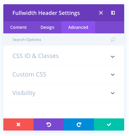
Fullwidth Header Advanced Options
Within the advanced tab, you will find options that more experienced web designers might find useful, such as custom CSS and HTML attributes. Here you can apply custom CSS to any of the module’s many elements. You can also apply custom CSS classes and IDs to the module, which can be used to customize the module within your child theme’s style.css file.
CSS ID
Enter an optional CSS ID to be used for this module. An ID can be used to create custom CSS styling, or to create links to particular sections of your page.
CSS Class
Enter optional CSS classes to be used for this module. A CSS class can be used to create custom CSS styling. You can add multiple classes, separated with a space. These classes can be used in your Divi Child Theme or within the Custom CSS that you add to your page or your website using the Divi Theme Options or Divi Builder Page Settings.
Custom CSS
Custom CSS can also be applied to the module and any of the module’s internal elements. Within the Custom CSS section, you will find a text field where you can add custom CSS directly to each element. CSS input into these settings are already wrapped within style tags, so you need only enter CSS rules separated by semicolons.
Visibility
This option lets you control which devices your module appears on. You can choose to disable your module on tablets, smart phones or desktop computers individually. This is useful if you want to use different modules on different devices, or if you want to simplify the mobile design by eliminating certain elements from the page.